Smart Strategies and Web Design Tips for Building Your Site
The internet is a competitive landscape full of brands vying for attention. Success in a digital world takes an in-depth understanding of making your website work harder, performing better, and delivering winning ROI.
Curious about how savvy marketers approach website design strategy?
This guide lays it out for you, outlining important factors to consider as you head down the path toward achieving your dream website.
- Find websites you love and Borrow from the best
- Start with the header & choose styles that suit your brand
- Menus can be more than dropdowns
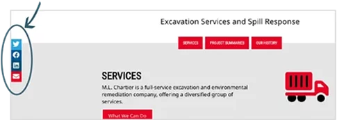
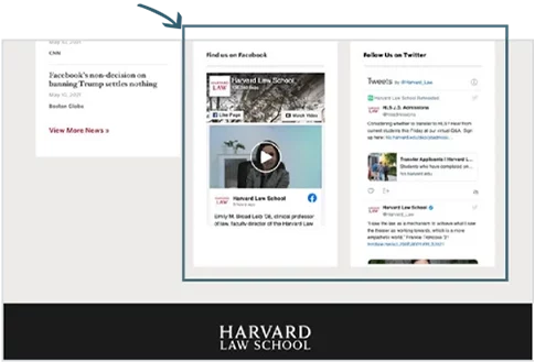
- Get connected with social media
- Page types & customization
- Maintain and elevate your SEO ranking
- Seal it with a submission – capturing leads
- Special features & functionality that add movement & customization
- Content management systems
- Growth driven design
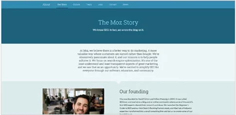
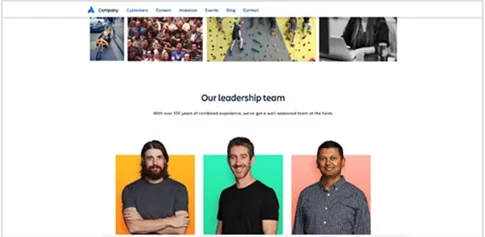
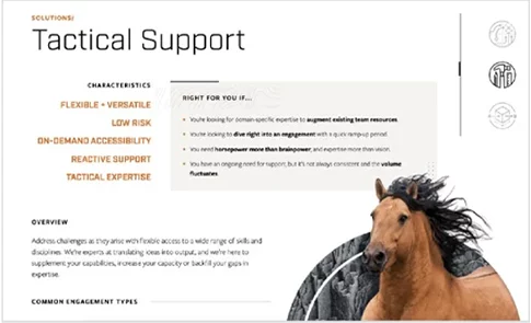
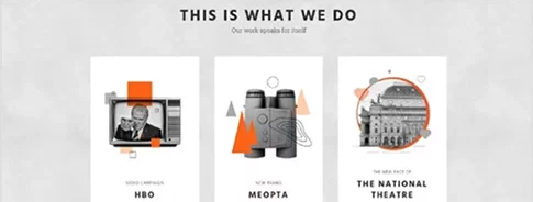
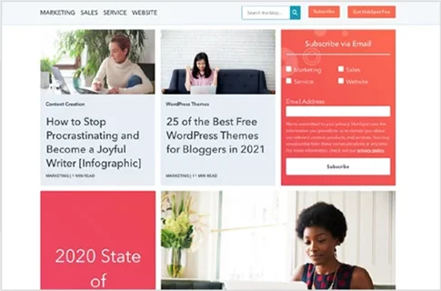
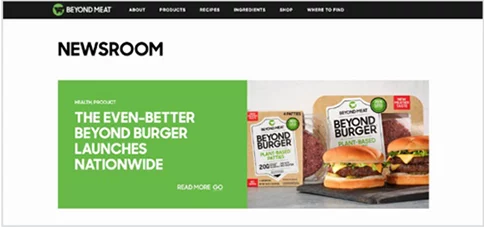
Pay attention to the websites of others in your industry, in industries that reach a similar audience, or that simply aim to achieve a similar goal. Identifying examples of websites that appeal to you as a user will help you form a solid foundation for your own new or refreshed website.
As you look for inspiration, ask yourself key questions, such as:
-
How well do these websites draw you in and hold your interest?
-
What specific features keep you engaged?
-
What kind of content is displayed, and how is it arranged?
-
In what ways might these websites be more appealing or user-friendly to your ideal customer?
Pinpointing what you like (and what you don’t) gives you an advantage when you start forming your own plan, so enjoy your browsing and take plenty of notes and screenshots!
Once you have a good idea of your overall vision, it’s time to focus on key individual elements.
This is when the real fun begins!
Start with the Header and Choose Styles that Suit your Brand
Your header sets the tone for your website; how do you want your brand presented to your website visitors?
If you gathered a list of other websites you like, you should now have a broad vision of the look and feel you want for your own.
IT’S TIME TO GET SPECIFIC, STARTING WITH THE HOME PAGE HEADER.
A website’s home page header is the first, most prominent element most online visitors notice. Since it also acts as a digital-first impression for many of your potential customers, it’s especially important to hit this one is out of the park.
Styles can vary, but the header and surrounding area are usually where your primary details and information are accessed or displayed. It all needs to work together both practically and aesthetically.
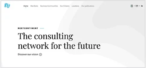
As you have looked at sites you love you have most likely been drawn to the top of the home page. We call this the header. Consider some of these header styles and envision how each might work for your own website:
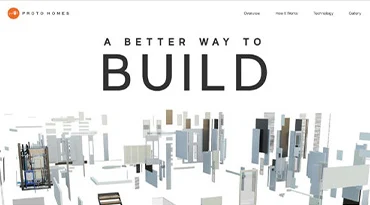
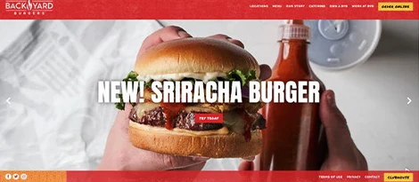
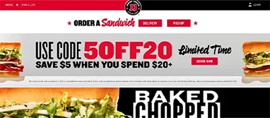
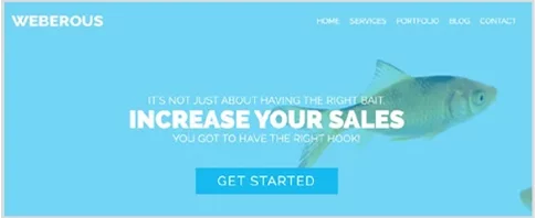
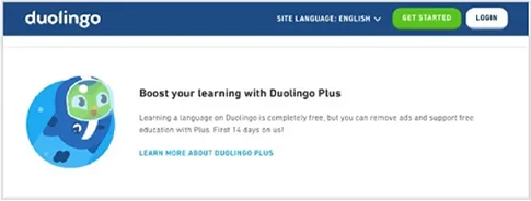
Call-to-action: Placing a featured call-to-action in one of the most prominent places on your website guarantees eyeballs on it and can therefore facilitate higher conversions. These are best used when there is a specific path you want your website visitor to take.
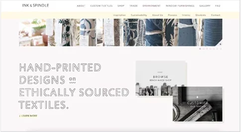
Typography with image: This will showcase text and an image with a background. This works well in many scenarios, most notably a product-specific website.
Choosing your Header Design is a Tough Decision, So Remember:
Your brand image and identity should remain front and center when making a final style decision, along with the tone and feel you want to convey.
For example, your company may be full of fun-loving goofballs, but if your brand is on the more serious end of the professional spectrum you need to ensure a more subdued, serious tone in the creative aspects of your website.
Equally important is the overarching purpose of the website itself.
-
If your website primarily handles online retail sales, your site’s purpose is very different from that of a local newspaper. Even if your retail store’s brand has a similar audience as that local newspaper, the purpose of each site is very different, and the design should be tailored accordingly.
Keep both of these important factors in mind when deciding how your website should greet your visitors.
Key Takeaways
Go beyond what simply looks good and find the design most likely to connect with your audience!

Menus Can be More than Drop-Downs
Navigation is one of the most important elements of a positive User Experience (UX).
Looks aren’t everything… aesthetics are important, but functionality is king. Your menu and navigation options need to be user-friendly and efficient. The type of navigation style you choose will impact the overall user experience (UX), so consider carefully what style might best suit your ideal customer.
Consider these common website navigation styles:
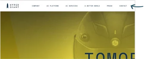
Horizontal Menu: This simple menu style features a single row of page options displayed across the top of your page. Its simplicity makes it easy to include within just about any design style.
Best used for smaller, simple sites with lower page counts- this common menu is less confusing than more elaborate styles and offers more easily identified, focused options to guide a visitor’s path.
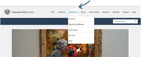
Dropdown Menu: It often looks like a plain-Jane horizontal menu at first glance, but when you hover over or click on the displayed option, more options drop down below. A dropdown menu can help clean up a busy layout and is generally user-friendly (especially for sites with a high page count and/or extensive sub-sections) if structured correctly.
Dropdown menus are at their best on a desktop, since they can be tricky to properly access via mobile – unless, of course, you have a Rockstar web developer to make it work seamlessly on all types of screens. (Hint: hit us up!)
These still work well for sites with lower page counts and less content complexity.
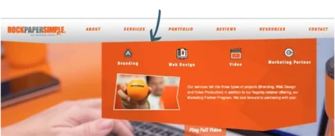
Best for visitors who want to browse several options in an easy at-a-glance layout, especially if they also see multiple conversion path options.
With this style of menu, you can include CTAs, images, and forms right in the menu.
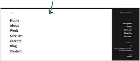
Hamburger: Also known as a three-line menu (and, rarely, a hotdog menu) this button features three stacked lines that expand when clicked or hovered over.
They’re usually placed in a top corner of a page, unobtrusive enough to blend in but noticeable enough to draw the visitor’s eye. Hamburger menus are a modern take with a minimalist design that switches easily between screen types.
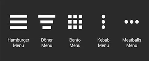
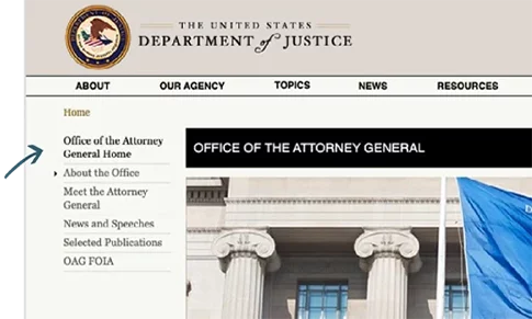
Sidebar: As the name suggests, this menu displays along the side of your page and can be used to highlight specific information. They are often more stylized to stand out rather than blend in with the background design.
Best used to direct traffic towards related service offerings or pages related to helpful content. These menus can also be used in conjunction with another type of navigation to support subpage categories related to the content of the page a viewer is on.
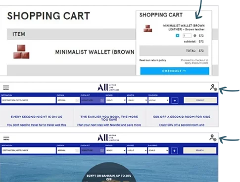
Sticky: This navigation style follows the user, keeping menu options visible no matter where your cursor is on the page. Sticky navigation could be combined with the look of other menu types (for example, keeping a horizontal menu or a sidebar menu visible while scrolling are two common options of sticky navigation).
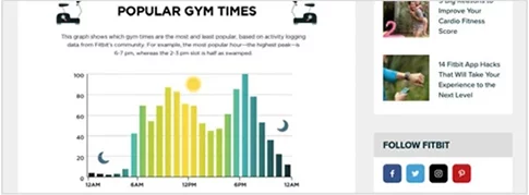
Sticky navigation first gained popularity for use on e-commerce sites, but the style has become increasingly popular for its ability to keep options close at hand. Just ensure that the way the menu “sticks” to the screen doesn’t distract from other valuable content.The first image shows the floating shopping cart image that “sticks” on top of the page; the second and third images show examples of a “sticky” horizontal search menu- the search menu stays the same while scrolling, so the images below change while the sticky part remains the same.
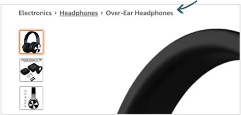
Breadcrumbs: These simple three-dot menus show the hierarchy of a user’s location within a website, allowing them to easily navigate back out to main pages.
While this style of navigation is never the sole menu style on a website, it can be useful for complex sites with extensive subcategories. Amazon.com and other e-commerce websites are perfect examples of breadcrumbs usage.
This is not an exhaustive list, merely a collection of some of the more popular styles to consider as you build your website wish list. More options are always emerging, though, so consult with an experienced team to help you better understand what and how different options can best achieve your goals.
Page Types and Customization
There are several different page types you’ll need to identify with your developer when building a website; think about the pages that require a little more flare and finesse. Any page that you want some extra umph on can often require a custom feature. These are some of the most common pages. When you shop for sites you love, look at these pages.
Our Products/Services: This is the page that should give your visitors the basic information to solve whatever problem caused them to find you in the first place.
Most importantly, this should give your website visitors a conversion path.
Note: These pages should absolutely be tailored to the user experience, not just what you might want them to see.
Too many products or offerings on one page can deter users from converting, just as unclear offerings can send them away.
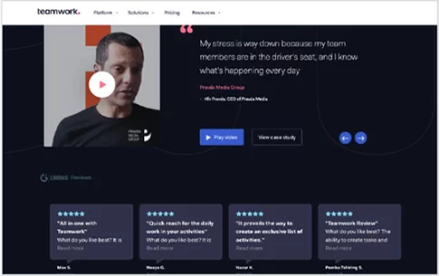
“What our Customers are Saying!” - Testimonials and Reviews: You can include a brief customer quote or two on your homepage or other important pages, but save extensive testimonials and reviews for a focused location on your site.
Here’s your chance to brag a little, through the words of your customers: collect that great customer feedback and proudly display it on a featured page of its own. According to a Pew Research Center Study, eight out of ten Americans (82%) say they consult online ratings and reviews when buying something for the first time; attaching positive testimonials and reviews to your own site can help tip the scales in your favor with leads who haven’t made up their minds yet (you can put the testimonial page to additional great use by linking directly to it at key stages of the buyer’s journey).
Key Takeaway
Your website content is crucial and should be tailored to work for your business, which means giving serious thought into what to include and why. Use our tips as a jumping-off point, but then get creative and think outside the box to customize a site that works for you.
Maintain & Elevate your SEO Ranking
Your developer will not usually be a Search Engine Optimization (SEO) expert, but they should know how to preserve your site visibility. Have this sidebar with your developer and make sure to ask what they do to protect you.
To enhance your success at following SEO best practices, a good CMS offers prompts and reminders for things like adding alt-text for
images, meta-data descriptions, and feedback on URL lengths, so you have additional support to achieving success! The tips below are just scratching the surface of what you can and should do for SEO.
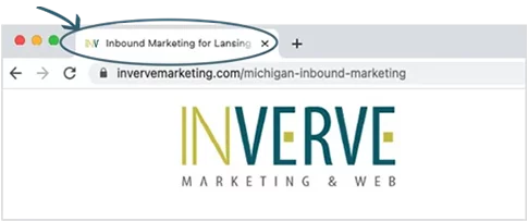
Title Tags: The little descriptor in a browser tab, while often overlooked or over-simplified, is one of the most effective website elements to keyword. If you’re looking to win the local SEO game, it’s also an opportunity to tie in your location.
H1s: This header helps a search engine identify the purpose of your page, so include the right keywords that describe and tie into the content for each and every page on your website.
H2s and H3s: These are the subsections, like the bullet points of an outline; they help the search engines identify secondary and tertiary relevant content as it relates to the main keyworded content.
(Again, those smart AI monsters take it all under consideration.)

Alt-Descriptions on images: This is an opportunity wasted by far too many, so by including descriptions on your images that are relevant to the main topics, you’ll already be ahead of the game.
What to avoid (or fix)
Additional, lesser-known elements that seriously impact your SEO success:
Redirects: Search engines really don’t like coming across those pesky HTTP status codes that indicate problems with pages loading due to server errors, broken links, etc. One of the most common, frustrating errors is the 404-redirect telling them a page they thought was there no longer exists. This could happen if you decide to remove a page entirely, combine it with another page, or just want to change the URL to better represent the page. Whatever causes it, make sure you fix it; your web developer can set up a 301-redirect to tell the search engine where to go instead, and the search engine will look upon you much more favorably.
Meta descriptions: Too many websites have missing meta descriptions or they use too much text; getting this piece right is a simple but important fix. While not a direct impact on SEO, meta descriptions are your opportunity to “win the click” once your site starts showing up in the search engine results.

This brief description that the search engine displays may be the reason a prospect actually follows through with a click instead of scrolling on by. Make sure it’s accurate, too, because a visitor that clicks through based on a meta-description, only to find content that doesn’t actually cover that topic, will be a visitor that bounces away from your site – and fast. Higher bounce rates DO have a significant impact on your SEO, so… make sure all these moving parts play well together.

HTTP without the S stifles your SEO: In short, if your site isn’t secure search engines are wary about sending their valued users to it, so your SEO will be negatively impacted. Fix it up by locking it down.
Robots and Canonical Tags (oh my!): If your site has (or will have) a lot of content, you’ll want to consider going more in-depth with these options to help improve the way search engines interpret your site. A Robot.txt can give specific instructions to search engines, such as avoiding certain pages you might not want to be included in your ranking. A canonical tag helps clear up confusion about older copy on your site and where to place priority. Talk to your Web development team about how and when to add or alter these features.
Suggestion for Content Planning
Google is constantly changing the playbook on what elements of your website it prioritizes when ranking for Search Engine Results Pages (SERPS). To stay ahead of the curve, talk to your digital marketing team about an ongoing SEO strategy that regularly monitors shifting standards along with other keyword reporting and website authority ranking metrics.
Seal it with a Submission:
Capturing Leads
A website without conversion paths is a wasted opportunity.
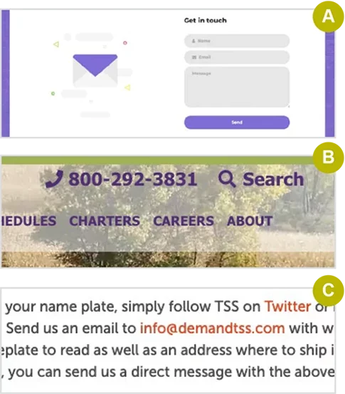
Today, most businesses have figured out that their website must have a contact form. If you’re like the vast majority of companies eager to thrive in the digital age, you’ve figured out that conversion paths are crucial. Talk to your developer about forms and other conversion points. You may only have one form on your site now, but you can help visitors connect with you in other ways:
![]() Contact form
Contact form
![]() Click to call phone number
Click to call phone number
![]() Email links throughout your content
Email links throughout your content
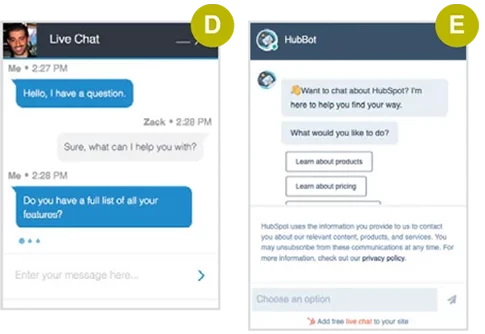
![]() Live Chat
Live Chat
![]() Chat Bot
Chat Bot
The goal is always to capture information.
Not every business needs every conversion type; before deciding what to include and where to include them, ensure the plan aligns with how your ideal customer prefers to communicate.
As useful as forms are, they also have the potential to annoy your prospective customers or turn someone away by asking too much or the wrong type of information. Pay close attention to the information you seek, how you are phrasing it, and what the user gets in return for providing the information. This is another good area to consult with a digital marketing team that can apply their experience in best practices to ensure a positive approach.
Special Features & Functionality that Add Movement and Customization
As your website vision takes shape, imagine some features that can take your website from good to great.
By now you should have a good idea of the elements you want, like your preferred header style, navigation type, etc. Let’s pull it all together and step back to look at the big picture. Look back at the sites that you loved and what elements they include from this list.
When considering the overall look and feel of your website, it’s worth noting some of these featured details that can enhance the overall user experience and take your website to the next level:
Parallax Effect: Adds visual interest while scrolling and makes for a memorable design.

Micro-animations: Delightful design elements add movement and increase interest towards the page.
Integrations: Get extra tech-savvy and consider connecting things like calendars, inventory stock, or an external portal to make for a better overall user experience.
Fonts: Best practices used to limit your font options, but a smarter emerging digital world (thanks, Google!) has opened up the possibilities so that a much broader variety of WedSafe font choices can be easily implemented. Just be careful not to go overboard; keep your fonts consistent (no more than 2-3 types, MAX!) and avoid loading multiple libraries, or your page load times could increase, and your SEO could take a hit.
Always think of your brand and how it should be communicated via the overall look and feel of your site. That includes ensuring cohesion with your brand’s style guide, which may require updates of its own to better fit in the digital landscape (for example, you might find yourself needing new colors and fonts to liven things up and stand out).
Key Takeaway
Your website is the most prominent digital representation of your brand. Make sure you go beyond the basics to set yourself up for success.
We highly recommend consulting with a talented team that includes marketers, designers, and developers so they can truly pull your vision together.
Content Management Systems (CMS)
What features are going to help you in your content management strategy?
A Content Management System (CMS) is a platform that helps users create, manage, and modify the content of a website without needing a degree in coding. Choosing the best CMS for your marketing needs will save you time, money, and sanity, so don’t overlook this detail. While this is one of the most important decisions you’ll make in your website build, it’s a lot of information to take in and isn’t nearly as fun as thinking through the visuals and special features that will make up the outward-facing website.
You’ve likely heard of CMS platforms (even if you didn’t fully understand what they were) like WordPress, Shopify, Joomla, Drupal, Squarespace, or Wix, to name a few common options. However, many of these are geared towards amateur sites or low-budget startups, rather than towards professional use. That can result in a lack of the specialized features that professional sites (and their savvy marketers) need to succeed.
Ultimately, how and where your website is built and managed may very well determine your overall level of satisfaction with the website itself, as it can determine whether future updates are streamlined and simple or frustrating and headache-inducing.
-
Do you want a completely custom website, or would you be okay using a templated system that allows you to somewhat customize with your own branding elements?
-
Do you want to add/remove/edit your content yourself or would you prefer enlisting a professional to make changes?
-
Do you want the ability to lock down who can make edits and how many edits and modifications can be made?
-
How important is a blog feature (and who should have access to publishing)?
-
Are you going to sell products in an online store?
-
How often will you need to update/manage forms?
-
Do you want to handle the hosting and security or hire a professional?

It’s important to recognize how much control you want over your own website updates, as that will play a big part in deciding what kind of CMS to use and how much outside help you might need on an ongoing basis. Consider the complexity of your website needs along with your available resources (and in this instance time might be a more valuable resource than money, so factor that in when deciding what route to take).
If you’re not looking for a content-rich website that stays up to date, the simpler CMS options could easily work for you. If, however, you plan to employ your website as a powerful digital marketing machine, you would almost certainly benefit from a more professional CMS.
Full disclosure: We’re a HubSpot shop that has worked within several different CMS platforms and we overwhelmingly prefer the HubSpot CMS to others. Why HubSpot? It’s intuitive and user-friendly, and it integrates well with other software platforms while remaining at the forefront of the inbound marketing world. Years of experience has created our team of loyal fans.
Choosing a CMS can and should be a big decision. Nothing is perfect for everyone.
Each CMS has specific benefits and drawbacks; how you answer the questions above can help a marketing and web development team guide you towards the best CMS for your own website needs.
TIP: HubSpot also has great FREE resources to explore before you make a final decision; if you need some support getting started we’re happy to share the love and show you the bells and whistles - reach out to us!
Growth-Driven Design
A website is never done. Be prepared to evolve with growth-driven design.
As quickly as things change in the digital world, you should know by now that a website is never done. Expect to re-evaluate and adapt regularly. Find a team you enjoy collaborating with and can trust for the long haul. It will be much more efficient to work with the same web designers and developers when you need to make changes over time.
Download the Guide and Take It With You!
Your website lays the groundwork for marketing success.


