Your business website is the hub for everything you have to offer. An all-in-one center for your biography, your portfolio or services, your insights…pretty much all your bragging rights. You know what content is available, where to find it and where to go if you can’t. Here’s the catch – can your customers? How your website works is just as, if not more important, than how it looks.
We find ourselves in an age of digital technology and information. People are no longer popping into stores to see what’s available, instead they are searching online. Think of your website as the first impression your company gives. When a customer clicks on that URL they want to be greeted in a warm, friendly manner. Imagine if you clicked on a webpage and were directed to this:

How long would you stay on the page?
If unable to find what they are looking for, the average user stays on a web page for only 10-20 seconds. Talk about a short attention span. Design your web page so that it keeps visitors’ eyes and attention.
Here’s a few tips to follow when designing your website.
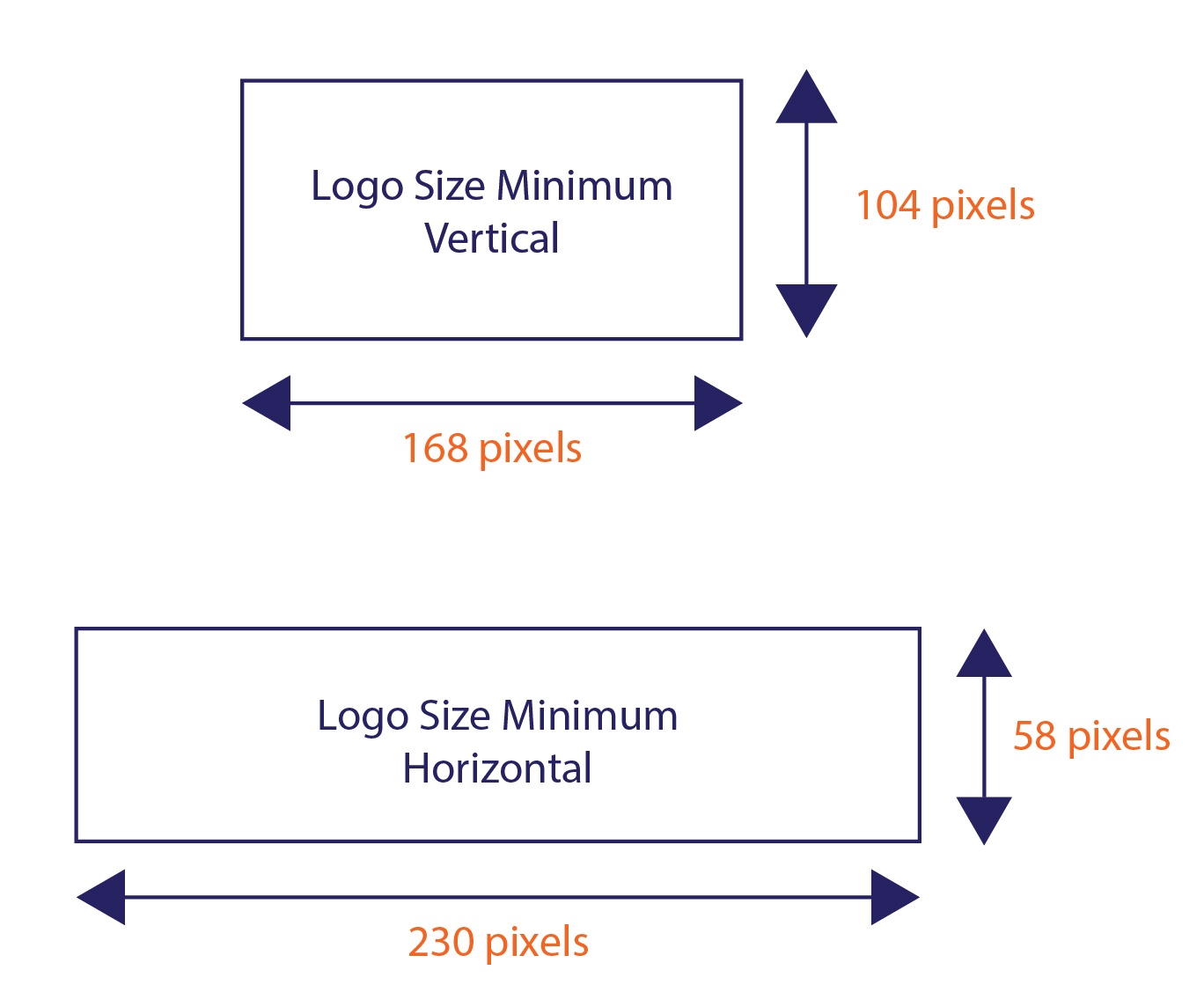
 1. Display your company’s logo. This should be common sense, but you’d be surprised how many web pages lack branding. Display the logo so that upon entering the web page, visitor’s eyes will be directed right to it (usually the upper, left-hand corner). Bigger isn’t always better – don’t size your logo so that it takes up 2/3 of your website. At the same time, make sure it’s large enough for people to recognize all the elements in it. Lastly, make sure you use a high resolution image so that the logo is easily readable. It is also convenient to link your logo to your homepage, so that customers can easily redirect.
2. Minimalism. A little white space never hurt anyone. Simplicity is key – use only the amount of text and images that are necessary to keep your customers’ eyes on the page. Try to avoid long paragraphs of text and flashy graphics with competing colors.
3. Fonts. You want your web pages to be visually appealing but also clean and professional. Choose a common font and use that font only! Follow the formatting techniques of headings, bullet points and brief paragraphs – ensuring fonts, their sizes and colors are used in a consistent manner.
4. Color. Remember: clean cut and professional, not a 2D Shrine Circus. Use a maximum of three or four colors (not including neutrals) and use them consistently. Make sure your background and text colors have enough contrast – viewers shouldn’t have to squint or sit inches from the screen to be able to see your content.
5. Navigation. When it all comes down to it, the end goal is finding answers. If users can’t find what they’re looking for your web page serves an impractical purpose. Navigation should be clear and simple. For best results, include both primary and secondary navigation that are clearly labeled.
6. The Extras. These are some very important extras that might be overlooked once your website code is written.
- Test to make sure all hyperlinks, both internal and external, are working
- Make sure your web pages are compatible with common browsers like Internet Explorer, Chrome, Firefox, Safari and mobile devices
- Test to ensure all multimedia included on the page is functional
- Keep content updated and free from error
The purpose of your web page is to present your company and everything it has to offer – optimize it to be aesthetically pleasing and practical. This way, customers can find what they are looking for when they are looking for it. Lastly, always test your design before launching it… you never know how big of a difference added white space or a lighter shade of yellow might make.
There are a lot of different factors that go into designing a new website...but the design aspect is only a small part. Don't forget about benchmarking your current metrics, clarifying your goals, or building your design around your personas.
Topics: Web


